Multiple Choice Type Configuration
When you select Multiple Choice as the Type for a custom attribute, you need to configure settings that are specific to the Multiple Choice data type.
To configure a Multiple Choice type custom attribute
1.Use the Choice List list to select the choice list that contains applicable values for the custom attribute.
If the Choice List list does not contain a suitable choice list, follow these steps to create a new choice list:
a.Click Create to the left of the Choice List list.
The Choice List list changes to the Choice List Name box.
b.In the Choice List Name box, enter a name for the new choice list.
c.Use the Choice List Type to select the data type for the choices in the new choice list. The available data types are as follows:
•Single-Line String — character string on a single line.
•Integer — whole number without a fractional part.
•Decimal — decimal number that may contain a fractional part.
•Date — calendar date (year, month, day).
•Duration — duration time (hh:mm:ss).
•Date & Time — calendar date (year, month, day) and time of day (hh:mm:ss).
d.New choice lists do not contain choices. After you save the custom attribute, refer to the procedure To add choices to a choice list to add choices to a new choice list.
2.Use the Order list to select how to order the choices in the selected choice list. The available ordering methods are as follows:
•As Entered — the order in which choices where added to the choice list.
•Alphabetical Ascending By Name — A to Z by choice name.
•Alphabetical Descending By Name — Z to A by choice name.
•Natural Ascending By Value — lowest to highest choice value.
•Natural Descending By Value — highest to lowest choice value.
3.In the Minimum box, enter the minimum number of choices that a user must select for the custom attribute.
4.In the Maximum box, enter the maximum number of choices that a user can select for the custom attribute.
5.Use the Default Value list to select the default choice or choices for the custom attribute.
This list is not available when you create a new choice list.
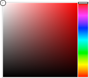
6.Click the Empty Cell Color color square.
The Color Picker opens.
7.Use the Color Picker to select the background color that Inception uses to display custom attribute cells that do not contain data.
Drag the slider on the right side of the Color Picker to select a color, and then click in the area to the left to select the color shade. As you use the Color Picker, the color square displays the selected color and a box to the right displays the HTML color code of the selected color. You can also enter an HTML color code in the box to select a color. As you enter an HTML color code, the color square displays the color of the entered code.
8.For the Populated Cell Color setting, click the Back color square to use the Color Picker to select the background color that Inception uses to display custom attribute cells that contain a selected choice.
9.Click the Fore color square to use the Color Picker to select the text color that Inception uses to display custom attribute cells that contain a selected choice.
10.In the Description box, enter a description of the custom attribute.
Only the Create Attribute and Edit Attribute pages display the description of a custom attribute.
11.Click Save.
Inception adds the new custom attribute to the Attributes page of the selected entity.
12.To view the new custom attribute, open the Inception grid associated with the entity to which you added the custom attribute.